Jeremy Zhao
Overview
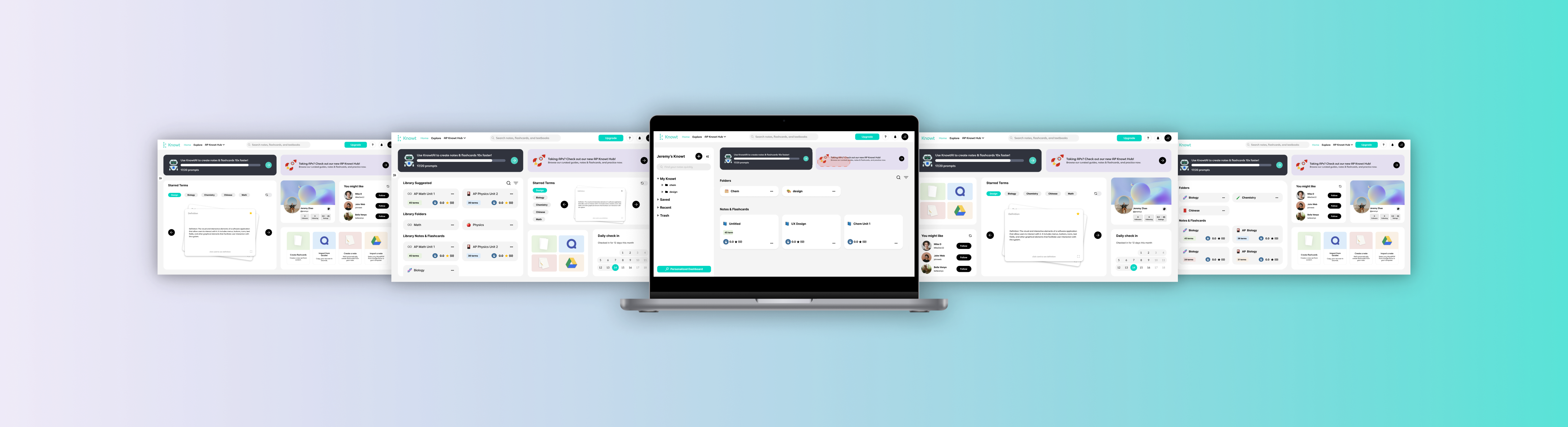
The website redesign project aimed to enhance the user experience of the Knowt Inc. platform for students studying AP and other courses. The focus was on improving the home page to provide a more intuitive and personalized interface.
Key features included a revamped navigation hierarchy, enhanced visibility of features, and the introduction of drag-and-drop customization with responsive component sizes. These improvements aimed to streamline workflows, empower users to create customized home pages, and cater to different learning preferences. The redesigned website sought to revolutionize note-taking and studying, delivering an engaging and user-friendly experience aligned with Knowt Inc.'s mission of transforming education through innovative technology.
Team
Jeremy Zhao
Tools
Figma
Current Problems
1. Unclear Navigation hierarchy
- There are three separate "Back to Home" buttons that are spaced far apart from each other. The navigation hierarchy of the sub-navigation and filters/quick action bar is also unclear.
- The navigation elements lack a clear hierarchy and are inconsistently placed, leading to user confusion and difficulty in navigating the website.
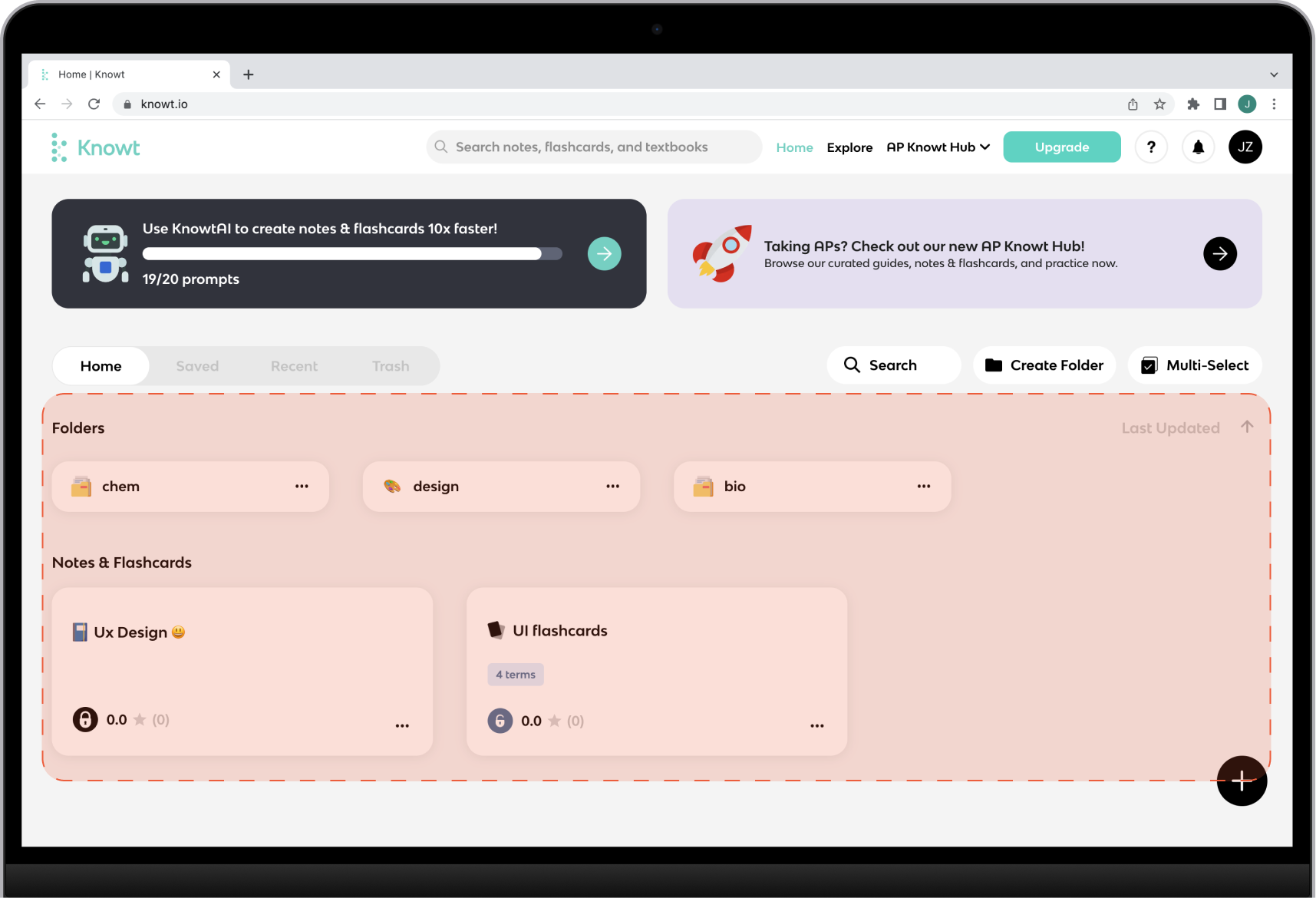
2. Difficulty in Finding Features
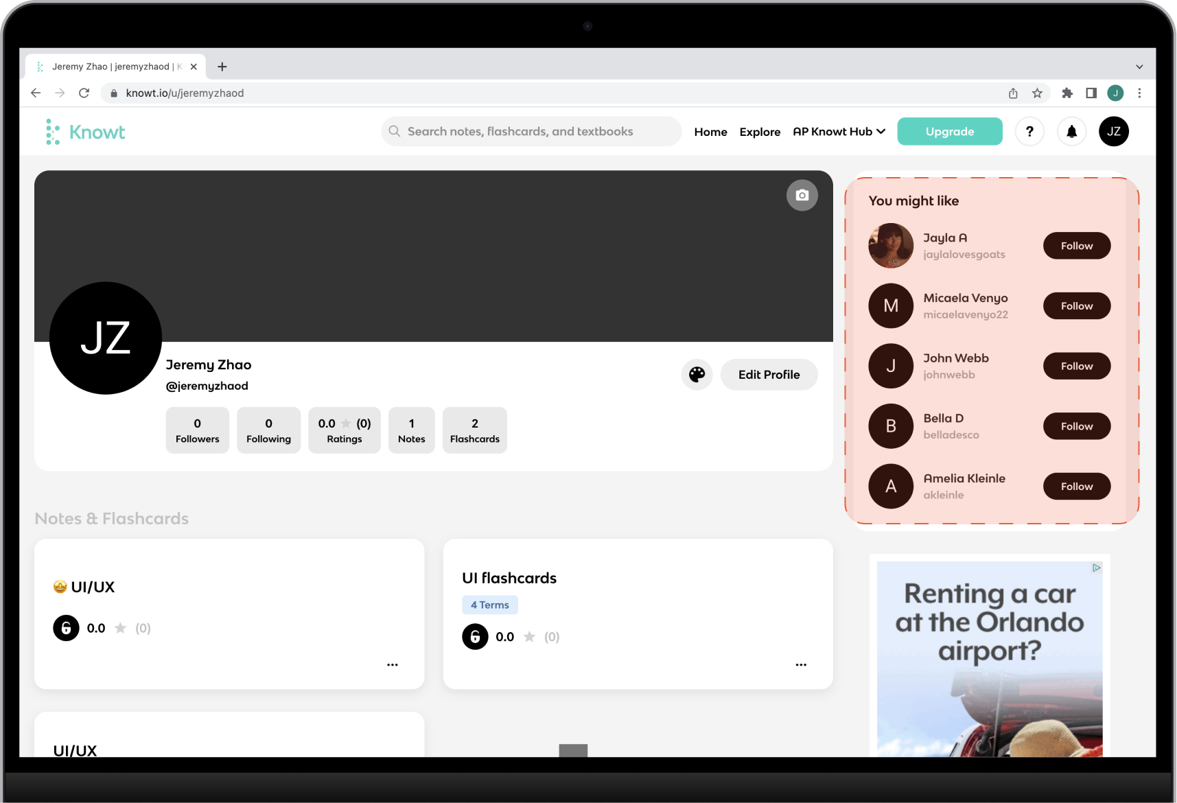
- It is challenging to find certain features, such as the library or saved content. The "You Might Like" feature in the personal profile page is also hard to locate and use.
- The lack of clear visibility and discoverability for important features makes it difficult for users to find and access the content they need.
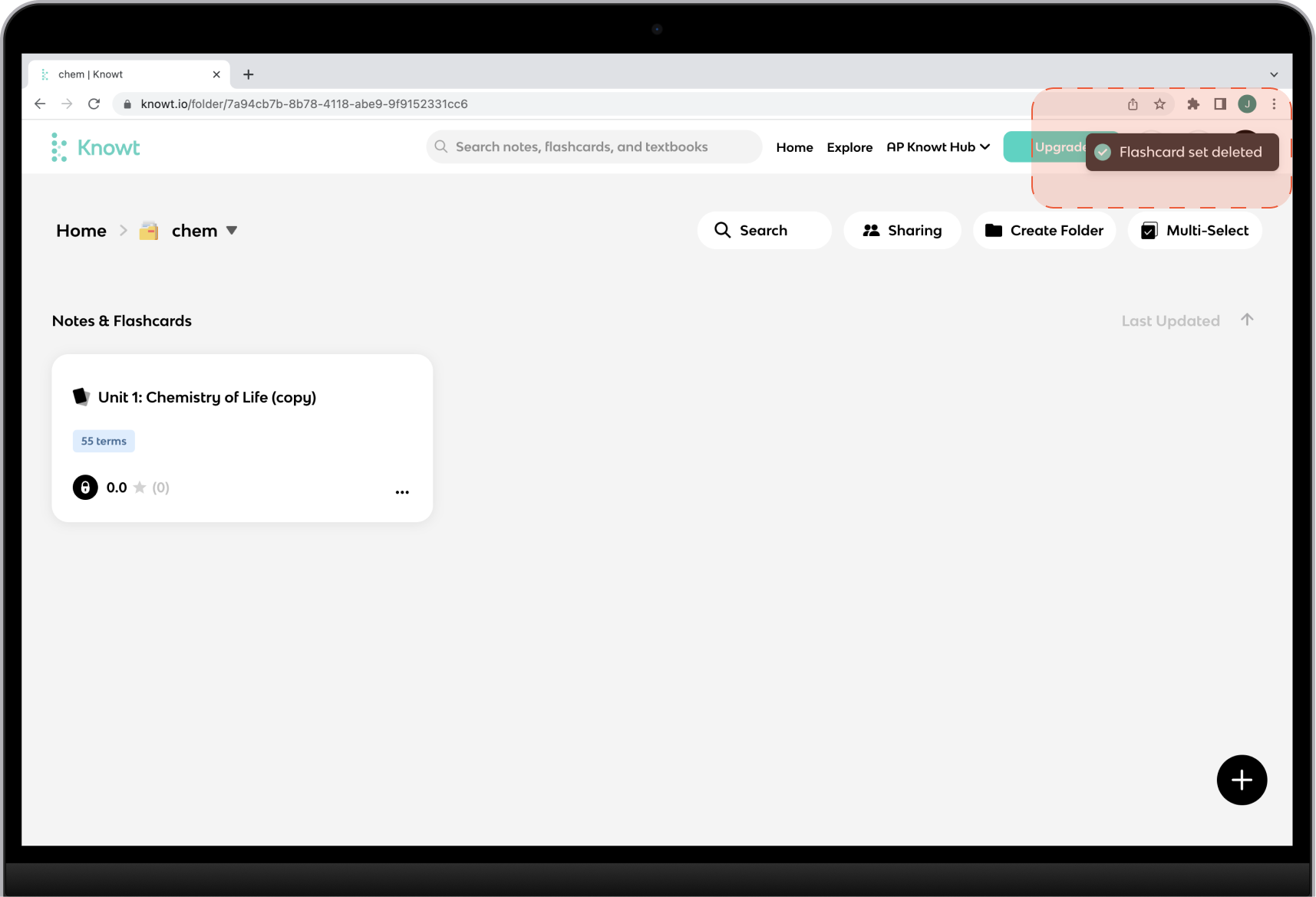
3. Lack of Redo/Undo Actions
- There is no undo action available when deleting or moving folders or notes.
- The absence of redo/undo functionality hinders user control and can lead to accidental data loss or unwanted changes.
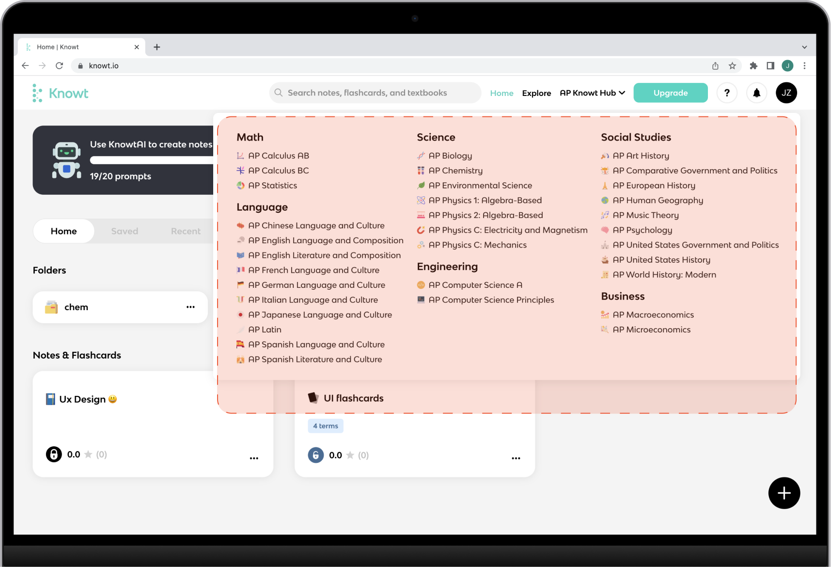
4. Content strategy
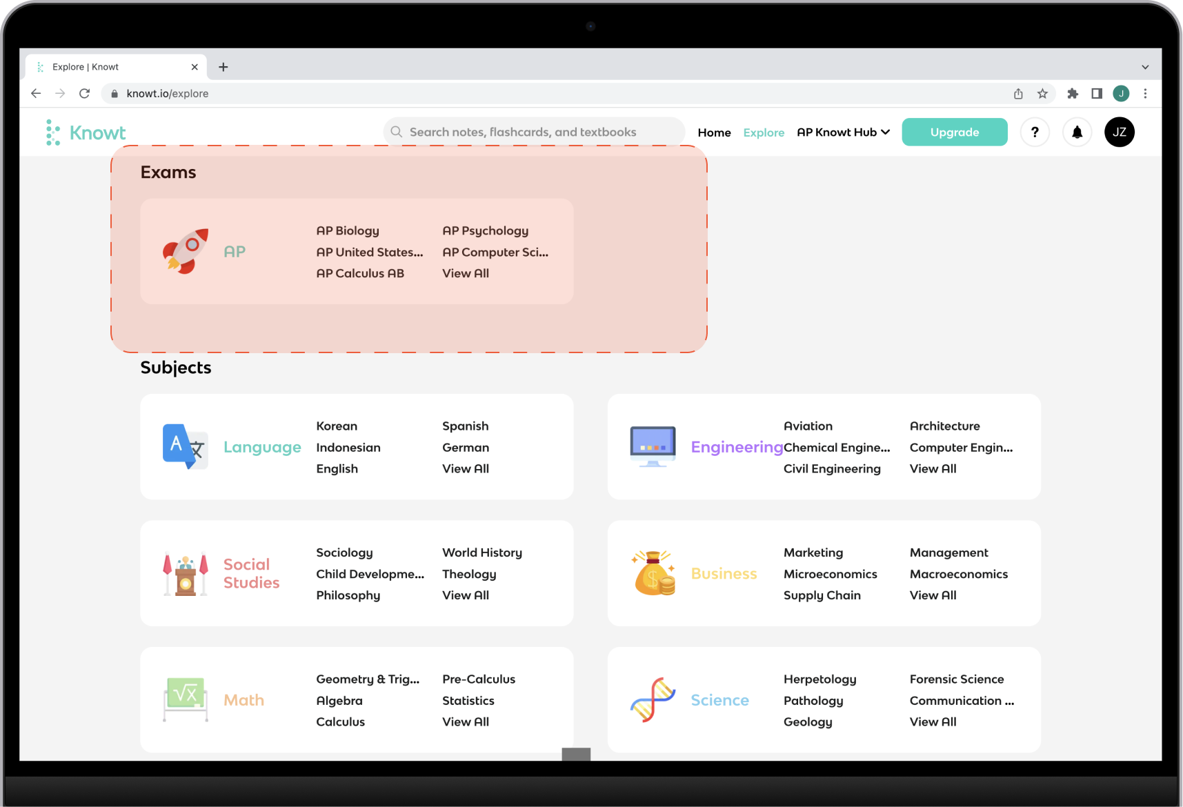
- Some content overlaps between the "Explore" section and the "AP Knowt Hub" section, causing confusion.
- Let's make sure the content is organized effectively, without repetition, to provide a clear and streamlined user experience.
🙋♂️Deliverables
These changes prioritize usability and personalization, creating a more intuitive and tailored experience for users. By removing unnecessary elements and introducing a personalized dashboard, the redesigned website aims to streamline interactions and provide users with a seamless and meaningful journey.

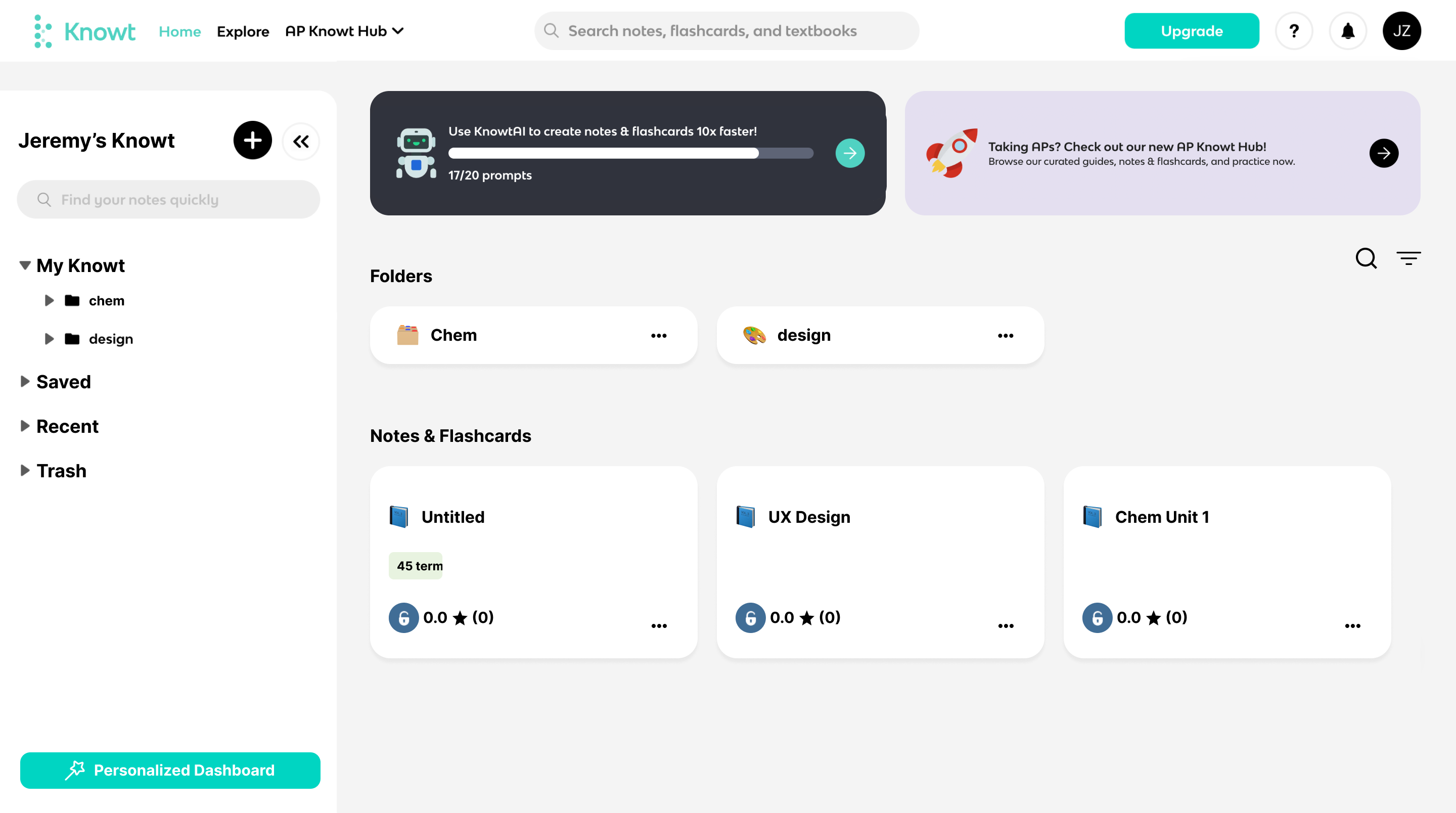
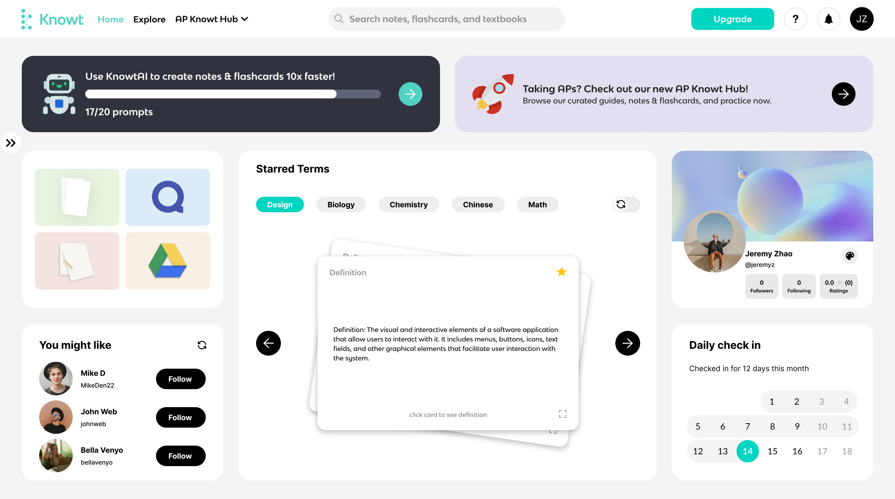
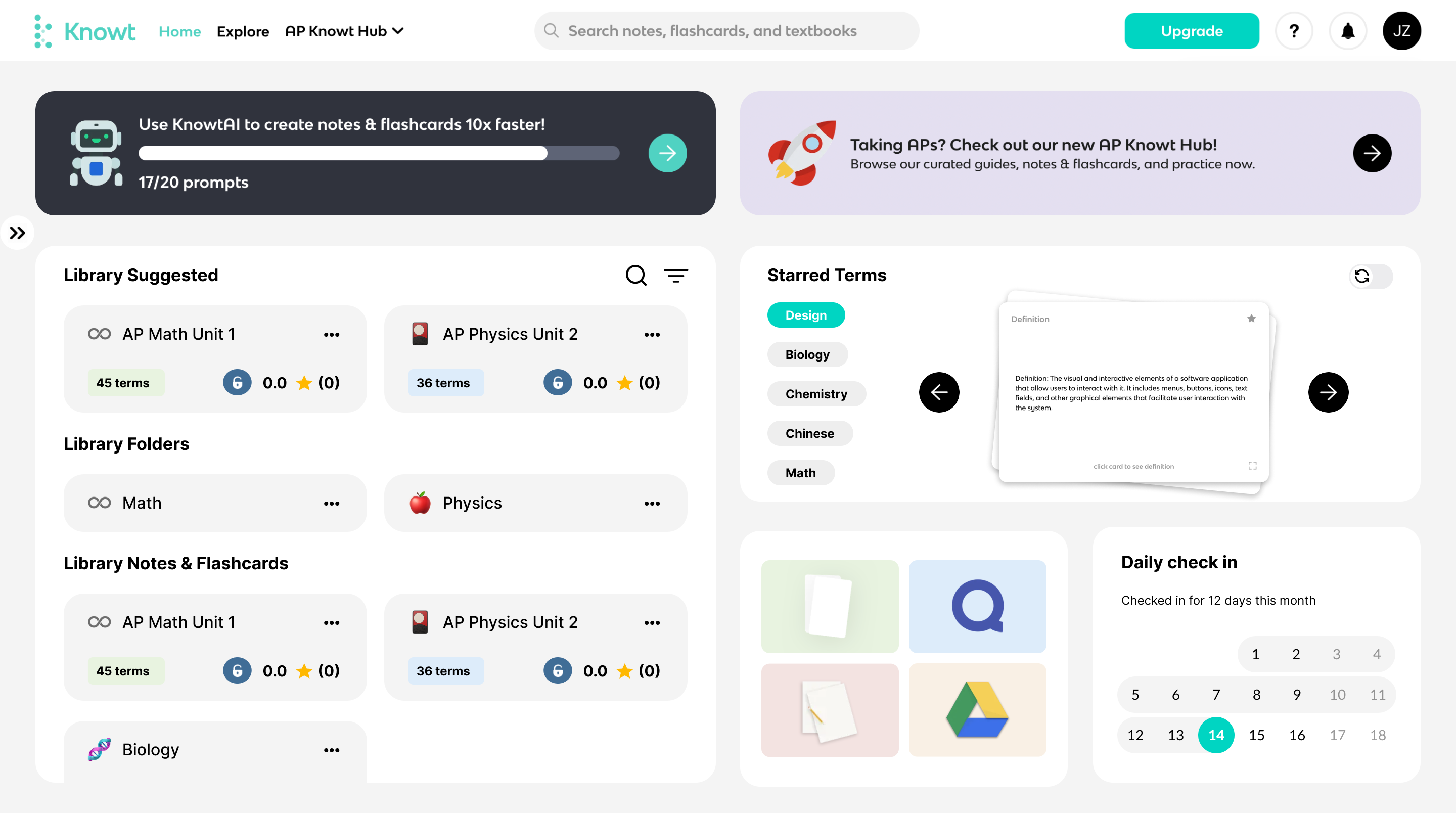
Old
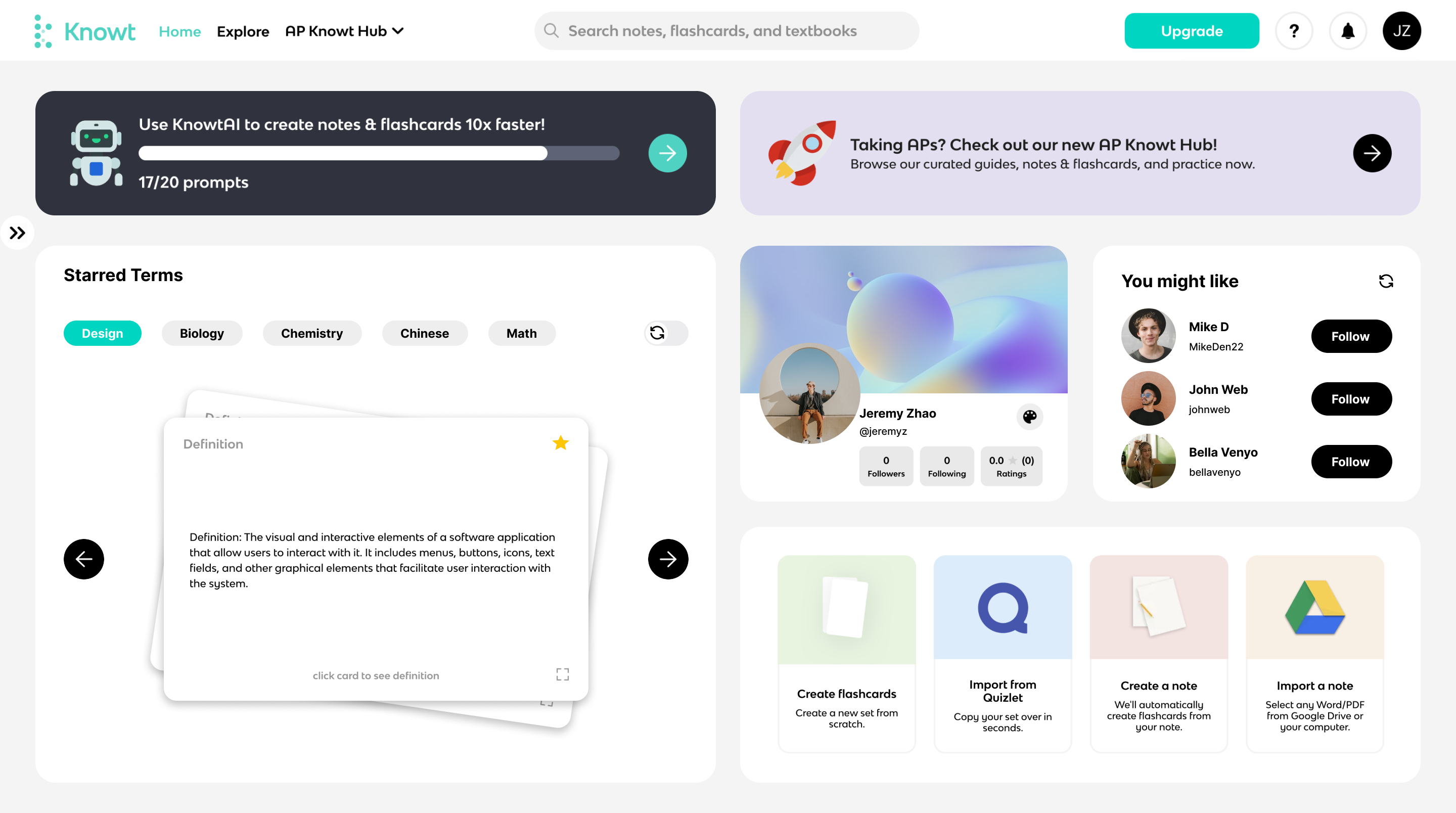
New
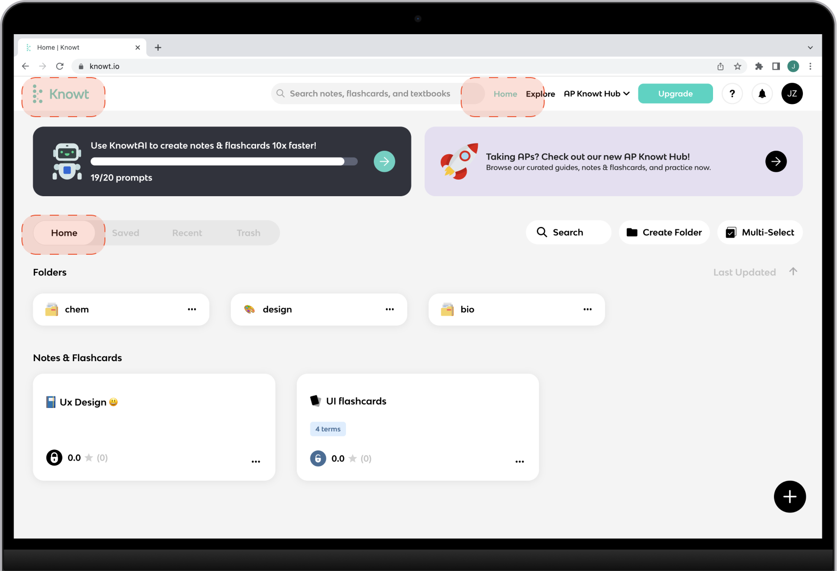
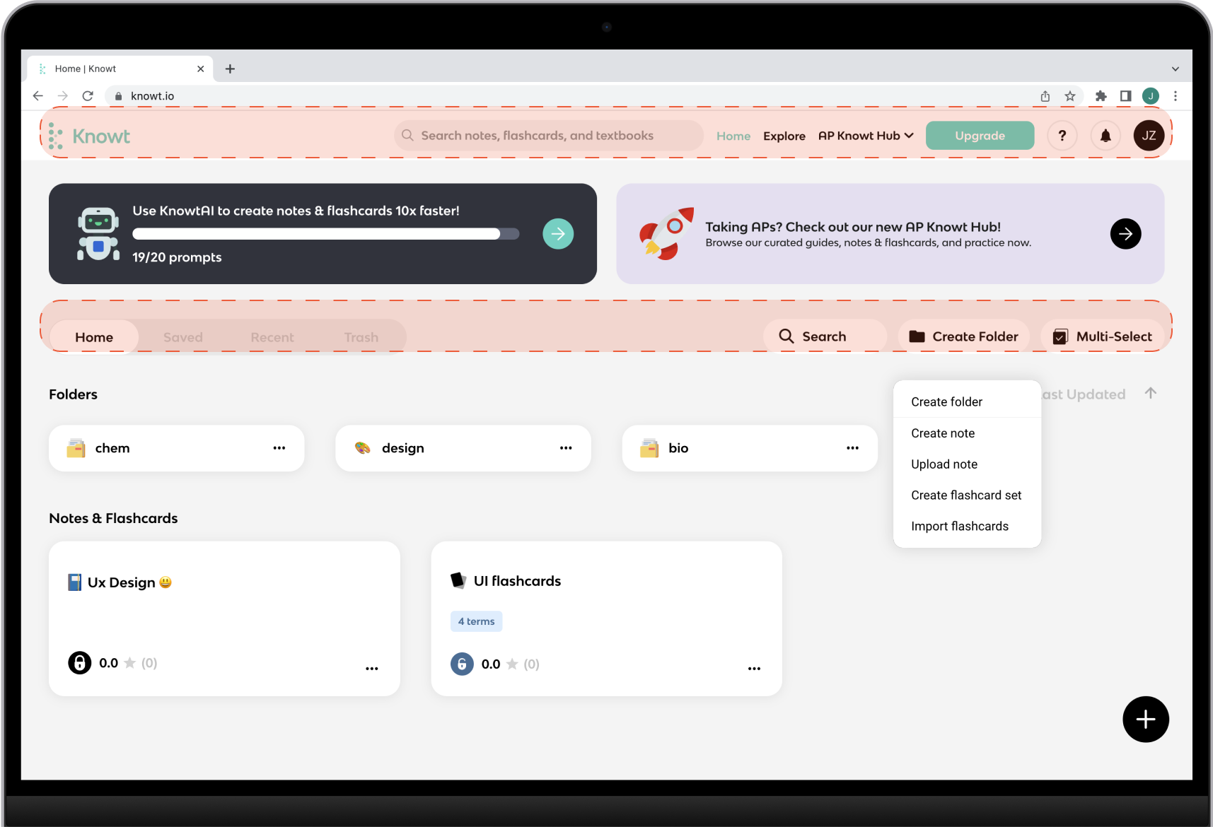
- Primary Navigation: The section order of the primary navigation was revised, moving "Home," "Explore," and "AP Knowt Hub" to the left. This change improves consistency and usability, as the Knowt logo and the "Home" section serve the same function. Placing them together ensures a clear and cohesive navigation experience.
- Responsive Side Navigation: The sub-navigation bar was redesigned into a responsive side navigation bar. This modification enhances the interface hierarchy and improves the clarity of navigation for users. The responsive nature of the side navigation bar ensures a consistent and intuitive experience across different devices.
- Renaming "Home" to "My Knowt": To provide better clarity, the "Home" section was renamed to "My Knowt." This change aligns the section label with its purpose, emphasizing that the section is personalized and tailored to the user's individual notes and flashcards. The new label enhances user understanding and navigation within the website.
- Consistency in UI: The design elements of Folders and Notes was adjusted to ensure visual consistency. By making them look more consistent in terms of typography, the overall aesthetic appeal of the website is improved. Consistency in UI elements enhances usability and creates a cohesive and professional visual experience for users.
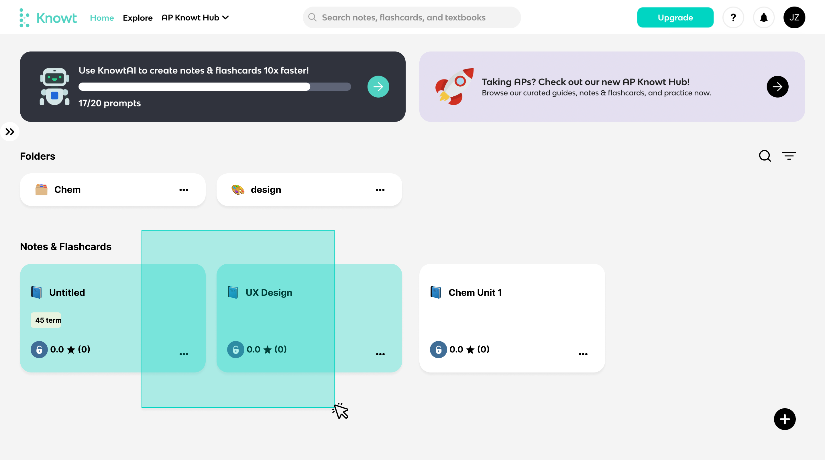
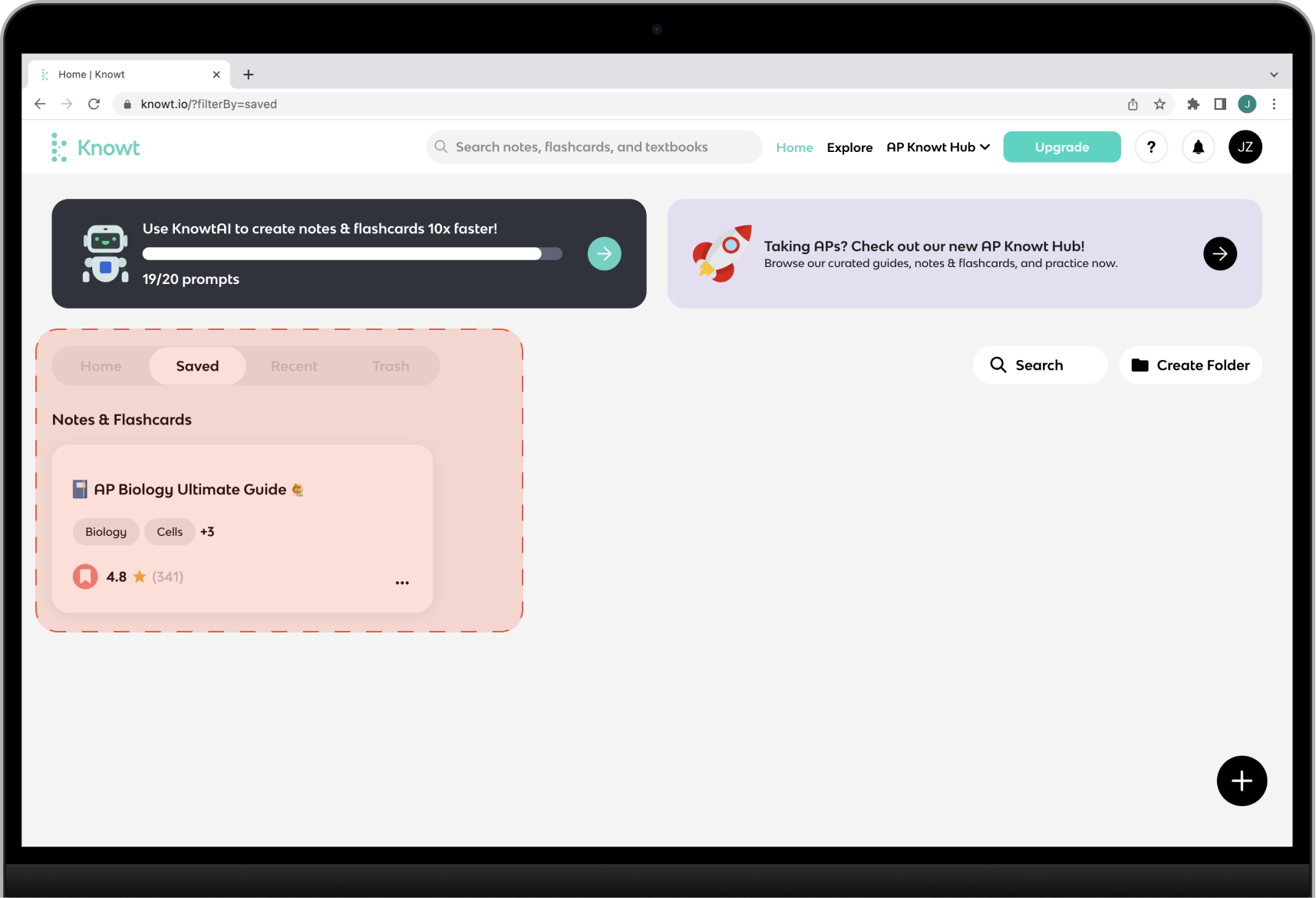
- Streamlined Selection Process: The "Multi-Select" button was removed, providing users with a more efficient way to select multiple objects. Instead, users can now simply drag an area to select multiple items. This change eliminates the need for an additional button and simplifies the interaction, making it more intuitive and seamless for users.
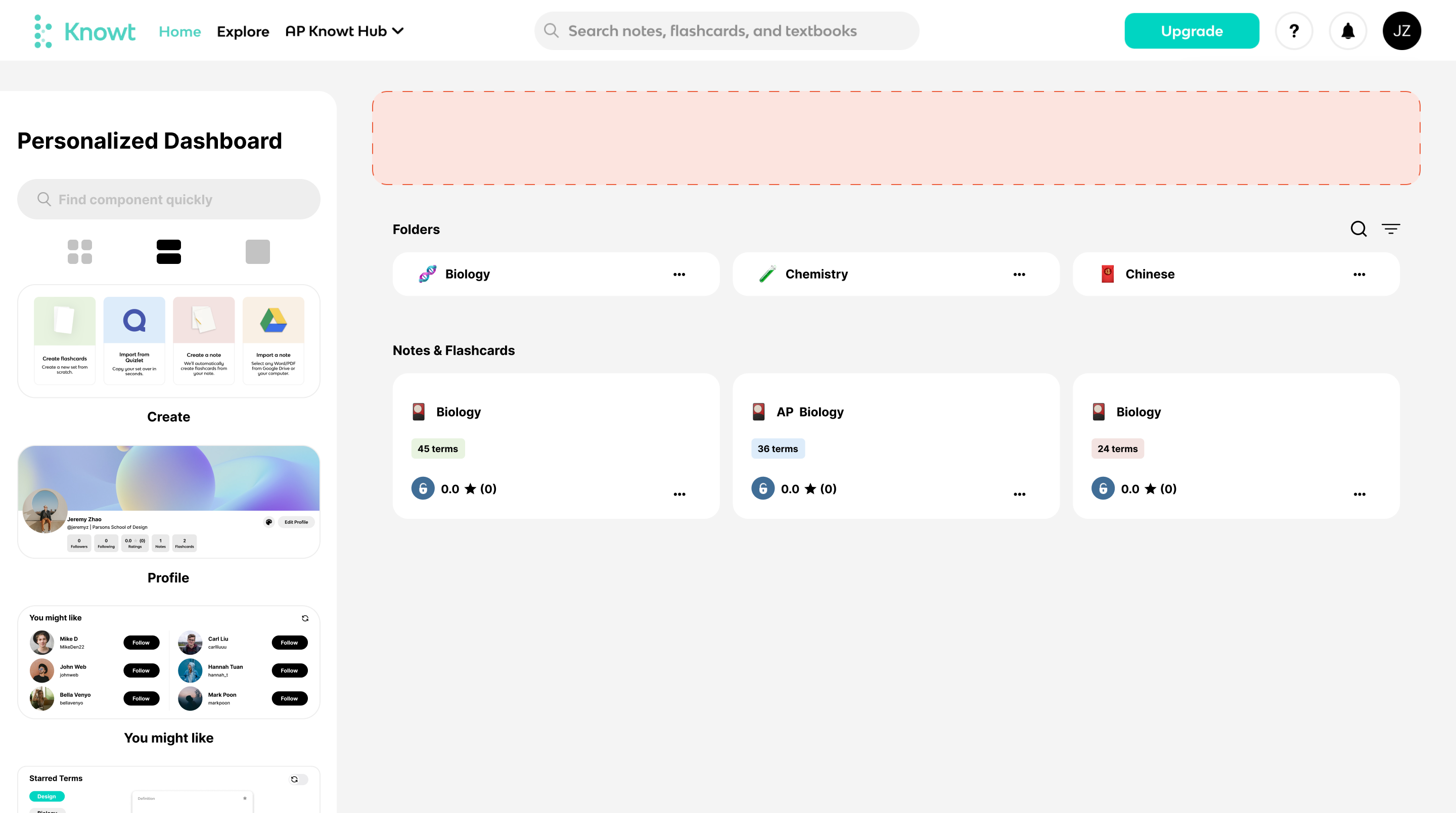
- Personalized Dashboard: A "Personalized Dashboard" button was added to the bottom of the side bar, marking the beginning of a new journey in user experiences. This button serves as a gateway to a customized and tailored dashboard, where users can add or hide personalized features. The inclusion of a personalized dashboard adds a sense of customization and relevance to the user experience, enhancing engagement and satisfaction.
✨Personalized Dashboard

The Personalized Dashboard introduces intuitive drag-and-drop functionality, allowing users to effortlessly add and rearrange components on their home page, providing a customized layout that suits their preferences. The components are intelligently categorized into three different sizes (1/8, 1/4, and 1/2 of the screen), ensuring adaptability and responsiveness to meet diverse user demands. This flexibility empowers users to create a personalized home page that optimally showcases the content and features they value most.
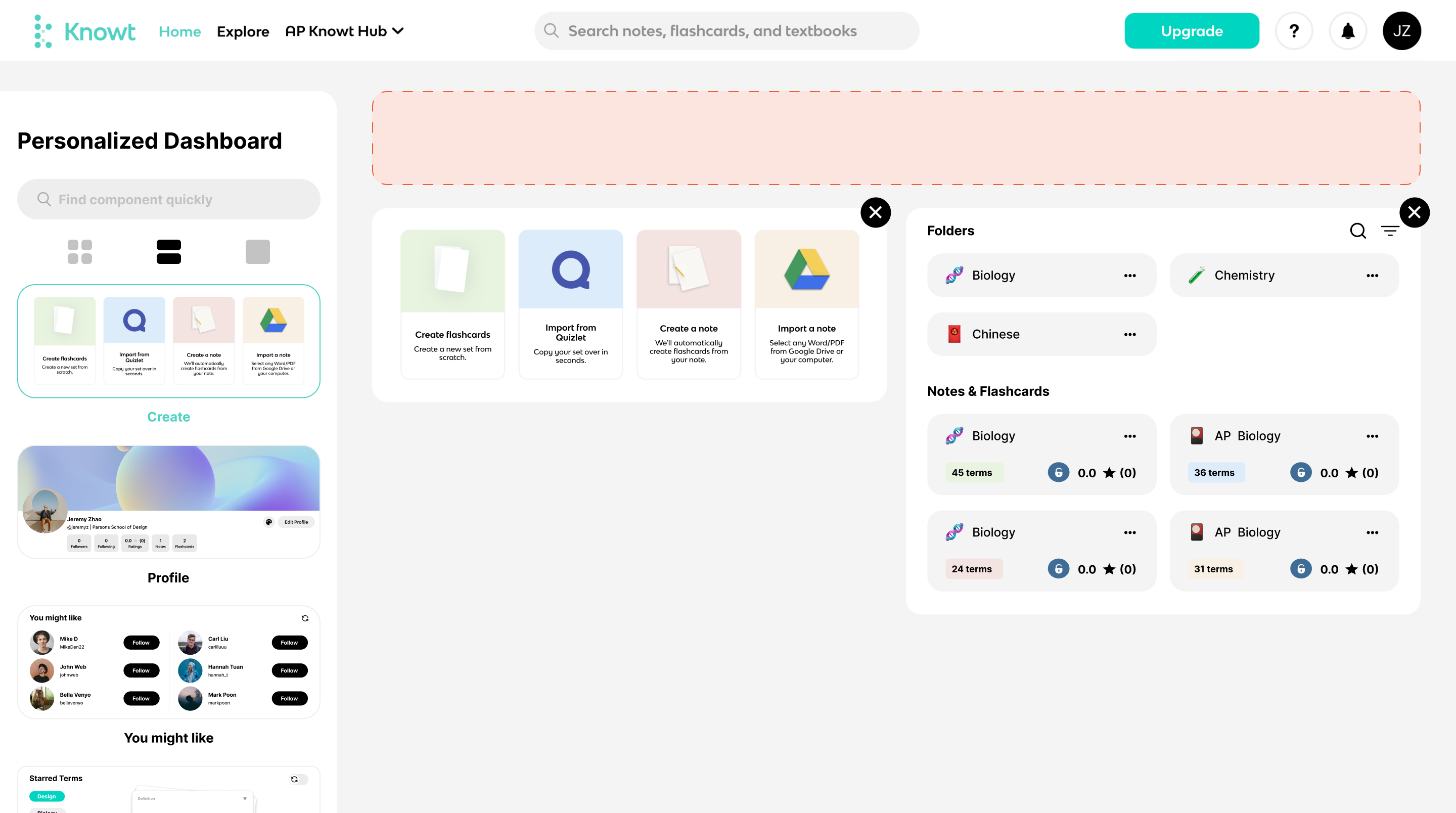
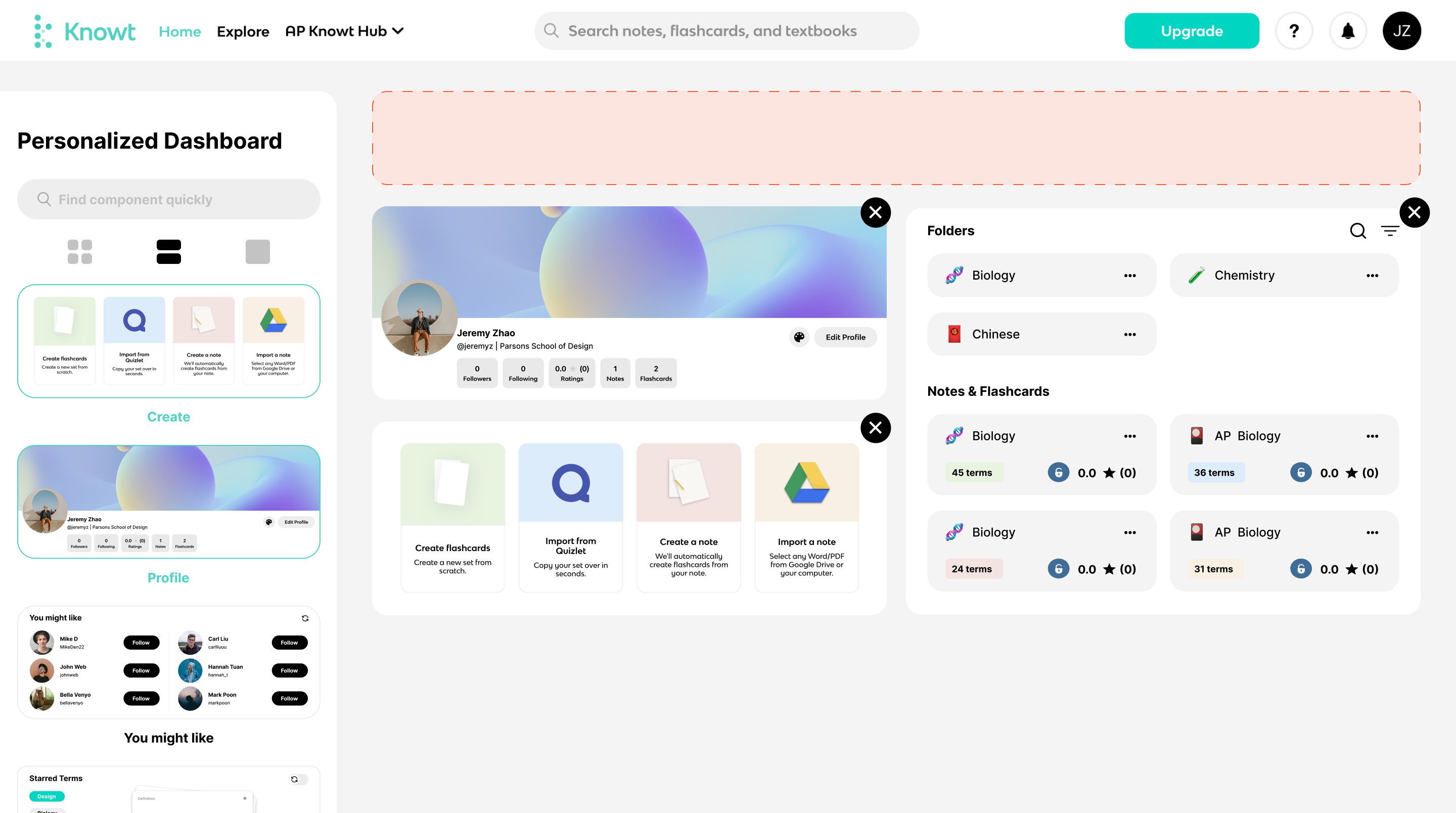
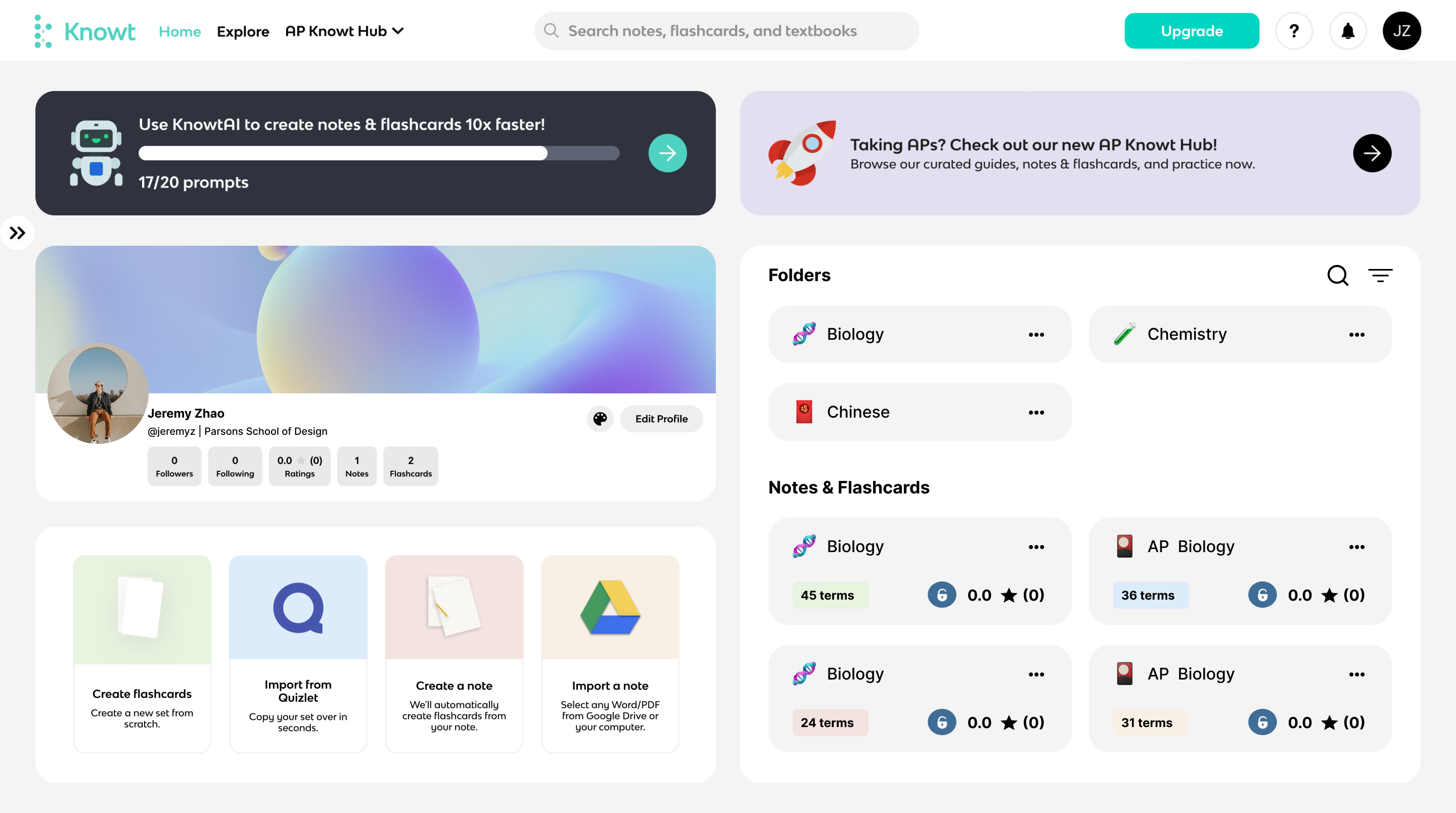
The newly introduced feature allows users to add, rearrange, and customize components on their home page, empowering them to personalize their experience and prioritize their primary needs from our website. This level of customization not only enhances user satisfaction but also helps retain more customers by providing them with the flexibility to adjust their home page layout at any time, ensuring a tailored and relevant user experience.
User
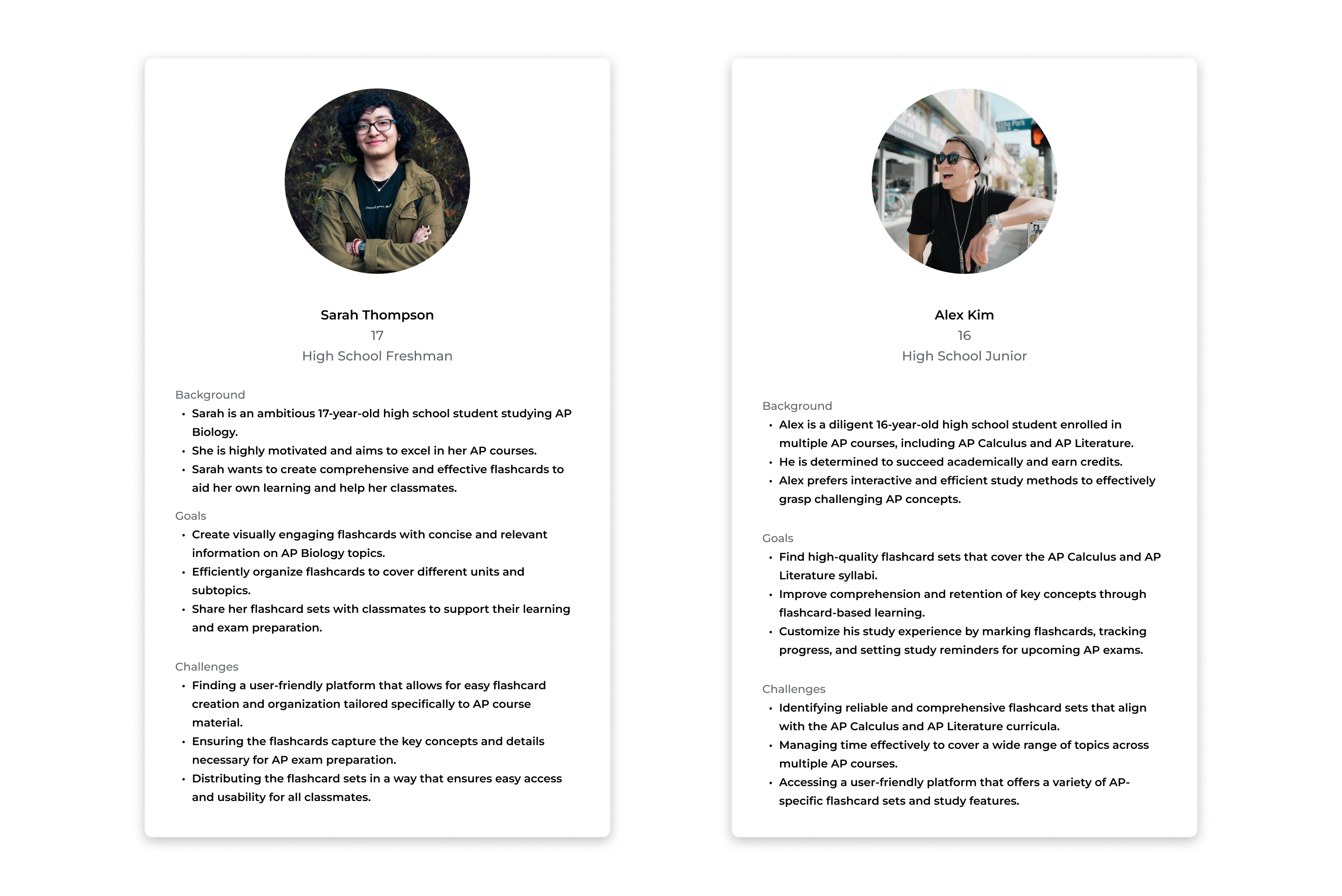
The website caters to both flashcard creators and flashcard users, who are students studying AP or any other courses. Flashcard creators focus on organizing and creating flashcards, while flashcard users use them for efficient studying. Designing intuitive interfaces and personalized experiences for these users will enhance their learning journey. However, the homepage currently prioritizes flashcard creators, offering organizational features, while flashcard users lack options for file organization. This disparity should be addressed to improve the organization and customization capabilities for flashcard users, ensuring a better studying experience. Gathering user feedback and conducting research will guide further improvements in design and functionality.
Design Thinking
Ideation
Different students have varying study habits, making it a significant challenge to meet the demands of all users. One potential solution is to implement a customized homepage feature. This allows students who prefer creating their own notes and flashcards to personalize their homepage, focusing on their specific needs. Similarly, students who prefer exploring and accessing existing study materials can customize their homepage to prioritize exploration. Considering that some users may fall into both categories, enabling everyone to customize their homepage according to their preferences would be beneficial. This customization would involve deciding which features are displayed on the homepage, empowering users to tailor their experience to align with their study habits and preferences.
Opportunities
- Enhanced Customization: Allowing users to add or hide components empowers them to customize the website according to their preferences and study habits. It acknowledges that each student has unique requirements and enables them to create a personalized learning environment.
- Streamlined User Experience: By giving users control over the components they see, we can streamline their experience. Users can focus on the features and content that are most relevant to their study goals, reducing clutter and enhancing usability.
- Flexibility for Different User Roles: Recognizing that users may play different roles (both flashcard creators and flashcard users), the option to add or hide components accommodates their shifting needs. They can easily switch between creator-focused or user-focused interfaces, depending on their current tasks and priorities.
- Progressive Disclosure: Allowing users to hide certain components can help prevent information overload and simplify the interface. Features that may not be immediately relevant or frequently used can be hidden, providing a cleaner and more intuitive interface.
- User Feedback and Insights: Monitoring user feedback and behavior can provide valuable insights into which components are most valued or frequently utilized. This data can inform decisions on which features to prioritize, add, or hide, ensuring continuous improvement of the website based on user preferences.
Conclusion
In conclusion, the proposed redesign focused on enhancing clarity, usability, and personalization. Key improvements included a more intuitive navigation hierarchy, the addition of redo/undo actions, improved visibility of features, and the introduction of drag-and-drop customization and responsive component sizes. These enhancements aimed to streamline workflows, provide greater control and organization, and deliver a tailored experience to cater to different learning preferences. The redesigned website seeks to revolutionize note-taking and studying, aligning with Knowt Inc.'s mission of transforming education through innovative technology.